ML
    • Recent
    • Categories
    • Tags
    • Popular
    • Users
    • Groups
    • Register
    • Login

    MD Anderson Threatening Ad
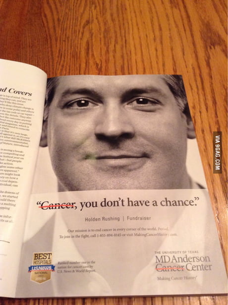
    Scheduled Pinned Locked Moved Water Closet
    82 Posts 6 Posters 11.0k Views
    Loading More Posts
    • Oldest to Newest
    • Newest to Oldest
    • Most Votes
    Reply
    • Reply as topic
    Log in to reply
    This topic has been deleted. Only users with topic management privileges can see it.
    • scottalanmillerS
      scottalanmiller @art_of_shred
      last edited by

      @art_of_shred said:

      This is an advertisement. The thing being threatened is cancer, not the patient. They are "wiping out cancer", as displayed with the red line crossing it off. Were it a grammatical correction, I would agree with you. It was probably posted on 9gag because it could certainly be taken that way, and its ambiguity is thus entertaining. However, I doubt that any reader with a double-digit IQ was actually scared by the ad and believes that AnMed is actively promoting the hunting down and killing of cancer patients. You take a look at it and view it in context. It makes perfect sense. Read between the lines. Oh, and when I said "anyone with a double-digit IQ", I was specifically not referring to people who post comments on 9gag...

      Remember I was pointing out how the ad is read.... quickly. The word CANCER is not visible to people reading it quickly at all. That something has been removed from the text is clear, what it is cannot be easily determined if you are passing by a billboard or airport ad.

      DustinB3403D 1 Reply Last reply Reply Quote 0
      • scottalanmillerS
        scottalanmiller @Dashrender
        last edited by

        @Dashrender said:

        Additionally, the red strikethrough appears to me to be there as a way to draw the eye to the word. If they wanted you to ignore it, they would make the strikethrough the same color as the text.

        Not how it works. You can't compare covering up a word to highlighting a word. It makes it unreadable in the manner in which these ads are normally read - walking by or driving by.

        art_of_shredA 1 Reply Last reply Reply Quote 0
        • art_of_shredA
          art_of_shred
          last edited by

          Hey, at least they spelled "cancer" correctly, and there's no "your" where it should be "you're". Honestly, that is better than 90% of everything I see out there anymore. It's just ridiculous.

          1 Reply Last reply Reply Quote 0
          • art_of_shredA
            art_of_shred @scottalanmiller
            last edited by

            @scottalanmiller said:

            @Dashrender said:

            Additionally, the red strikethrough appears to me to be there as a way to draw the eye to the word. If they wanted you to ignore it, they would make the strikethrough the same color as the text.

            Not how it works. You can't compare covering up a word to highlighting a word. It makes it unreadable in the manner in which these ads are normally read - walking by or driving by.

            That IS how it works. It's how ads have been since, like, forever. I couldn't even count the number of times a word in an ad had a strike-through. The whole point of the strike-through in advertisement is to draw emphasis to that exact word. It's not about correct English; it's about grabbing attention.

            scottalanmillerS 1 Reply Last reply Reply Quote 0
            • scottalanmillerS
              scottalanmiller @art_of_shred
              last edited by

              @art_of_shred said:

              @scottalanmiller said:

              @Dashrender said:

              Additionally, the red strikethrough appears to me to be there as a way to draw the eye to the word. If they wanted you to ignore it, they would make the strikethrough the same color as the text.

              Not how it works. You can't compare covering up a word to highlighting a word. It makes it unreadable in the manner in which these ads are normally read - walking by or driving by.

              That IS how it works. It's how ads have been since, like, forever. I couldn't even count the number of times a word in an ad had a strike-through. The whole point of the strike-through in advertisement is to draw emphasis to that exact word. It's not about correct English; it's about grabbing attention.

              It does not grab attention. It covers up. This is not a magazine ad but a billboard ad. No amount of making hard to see or hard to read grabs attention. It literally makes the word nearly disappear. It only exists at all to people dissecting it and reading into it.

              art_of_shredA 1 Reply Last reply Reply Quote 0
              • scottalanmillerS
                scottalanmiller @Dashrender
                last edited by

                @Dashrender said:

                I don't find these two lines to be even remotely the same (the comma doesn't matter) when used in this context. Now, if this was on a paper being graded by a teacher, boss, etc, etc - fine they would more or less be the same sentence, but in this case the advertiser (in my opinion) is claiming that they are defeating cancer.

                Okay, but without adding in personal injections of meaning, what do they mean? Either of them? If you aren't talking about YOU... what the heck IS it talking about?

                1 Reply Last reply Reply Quote 0
                • scottalanmillerS
                  scottalanmiller
                  last edited by

                  Using the strike out to mean "no longer" is a common use. That I'll give. But given the common way this is used for an ad like this.... it's not the meaning that @Dashrender is coming to. If you look at ads that do this, and I've seen a lot, they always follow the same pattern (without the weird threat.) And that usage would mean a change from being a cancer center to being a general hospital.

                  1 Reply Last reply Reply Quote 0
                  • art_of_shredA
                    art_of_shred @scottalanmiller
                    last edited by

                    @scottalanmiller said:

                    @art_of_shred said:

                    @scottalanmiller said:

                    @Dashrender said:

                    Additionally, the red strikethrough appears to me to be there as a way to draw the eye to the word. If they wanted you to ignore it, they would make the strikethrough the same color as the text.

                    Not how it works. You can't compare covering up a word to highlighting a word. It makes it unreadable in the manner in which these ads are normally read - walking by or driving by.

                    That IS how it works. It's how ads have been since, like, forever. I couldn't even count the number of times a word in an ad had a strike-through. The whole point of the strike-through in advertisement is to draw emphasis to that exact word. It's not about correct English; it's about grabbing attention.

                    It does not grab attention. It covers up. This is not a magazine ad but a billboard ad. No amount of making hard to see or hard to read grabs attention. It literally makes the word nearly disappear. It only exists at all to people dissecting it and reading into it.

                    It must be your eyesight condition that makes it that hard to see. I have no trouble at all seeing that it says cancer and was stricken-through with a red line. Plain as day.

                    scottalanmillerS 1 Reply Last reply Reply Quote 0
                    • scottalanmillerS
                      scottalanmiller @art_of_shred
                      last edited by

                      @art_of_shred said:

                      @scottalanmiller said:

                      @art_of_shred said:

                      @scottalanmiller said:

                      @Dashrender said:

                      Additionally, the red strikethrough appears to me to be there as a way to draw the eye to the word. If they wanted you to ignore it, they would make the strikethrough the same color as the text.

                      Not how it works. You can't compare covering up a word to highlighting a word. It makes it unreadable in the manner in which these ads are normally read - walking by or driving by.

                      That IS how it works. It's how ads have been since, like, forever. I couldn't even count the number of times a word in an ad had a strike-through. The whole point of the strike-through in advertisement is to draw emphasis to that exact word. It's not about correct English; it's about grabbing attention.

                      It does not grab attention. It covers up. This is not a magazine ad but a billboard ad. No amount of making hard to see or hard to read grabs attention. It literally makes the word nearly disappear. It only exists at all to people dissecting it and reading into it.

                      It must be your eyesight condition that makes it that hard to see. I have no trouble at all seeing that it says cancer and was stricken-through with a red line. Plain as day.

                      You are not walking by it to the side in a moving airport area. Trust me, you don't see the word cancer where this ad is placed. Dominica checked it to in situ and agreed.

                      art_of_shredA 1 Reply Last reply Reply Quote 0
                      • art_of_shredA
                        art_of_shred @scottalanmiller
                        last edited by

                        @scottalanmiller said:

                        @art_of_shred said:

                        @scottalanmiller said:

                        @art_of_shred said:

                        @scottalanmiller said:

                        @Dashrender said:

                        Additionally, the red strikethrough appears to me to be there as a way to draw the eye to the word. If they wanted you to ignore it, they would make the strikethrough the same color as the text.

                        Not how it works. You can't compare covering up a word to highlighting a word. It makes it unreadable in the manner in which these ads are normally read - walking by or driving by.

                        That IS how it works. It's how ads have been since, like, forever. I couldn't even count the number of times a word in an ad had a strike-through. The whole point of the strike-through in advertisement is to draw emphasis to that exact word. It's not about correct English; it's about grabbing attention.

                        It does not grab attention. It covers up. This is not a magazine ad but a billboard ad. No amount of making hard to see or hard to read grabs attention. It literally makes the word nearly disappear. It only exists at all to people dissecting it and reading into it.

                        It must be your eyesight condition that makes it that hard to see. I have no trouble at all seeing that it says cancer and was stricken-through with a red line. Plain as day.

                        You are not walking by it to the side in a moving airport area. Trust me, you don't see the word cancer where this ad is placed. Dominica checked it to in situ and agreed.

                        All I am seeing is the one in the OP here. It's very clearly readable in that ad. This entire thread feels about the equivalent of having to explain a knock-knock joke.

                        scottalanmillerS DashrenderD 2 Replies Last reply Reply Quote 2
                        • DustinB3403D
                          DustinB3403 @scottalanmiller
                          last edited by

                          @scottalanmiller I read a magazine article a while back, which specifically studied how people read. So Scott, I'm sorry you're wrong here.

                          The meaning does seem different, and even difficult to understand.

                          But people can read entire books even if the lower half of the letters were completely absent.

                          scottalanmillerS art_of_shredA 2 Replies Last reply Reply Quote 0
                          • scottalanmillerS
                            scottalanmiller @DustinB3403
                            last edited by

                            @DustinB3403 said:

                            @scottalanmiller I read a magazine article a while back, which specifically studied how people read. So Scott, I'm sorry you're wrong here.

                            The meaning does seem different, and even difficult to understand.

                            But people can read entire books even if the lower half of the letters were completely absent.

                            That's not related. Covered up entirely so that you don't even catch that the word is there is completely different than the article you read, which is very well known and not in question. Of course people can read missing letters we do it every day. But filling in a missing word we have no reason to know is missing when we are not trying to read the ad at all is different, completely.

                            art_of_shredA 1 Reply Last reply Reply Quote 0
                            • art_of_shredA
                              art_of_shred @DustinB3403
                              last edited by

                              @DustinB3403 said:

                              @scottalanmiller I read a magazine article a while back, which specifically studied how people read. So Scott, I'm sorry you're wrong here.

                              The meaning does seem different, and even difficult to understand.

                              But people can read entire books even if the lower half of the letters were completely absent.

                              Thank you for using "you're" correctly!

                              DustinB3403D 1 Reply Last reply Reply Quote 3
                              • DustinB3403D
                                DustinB3403 @art_of_shred
                                last edited by

                                @art_of_shred I try to not mess those up......

                                1 Reply Last reply Reply Quote 1
                                • scottalanmillerS
                                  scottalanmiller @art_of_shred
                                  last edited by

                                  @art_of_shred said:

                                  @scottalanmiller said:

                                  @art_of_shred said:

                                  @scottalanmiller said:

                                  @art_of_shred said:

                                  @scottalanmiller said:

                                  @Dashrender said:

                                  Additionally, the red strikethrough appears to me to be there as a way to draw the eye to the word. If they wanted you to ignore it, they would make the strikethrough the same color as the text.

                                  Not how it works. You can't compare covering up a word to highlighting a word. It makes it unreadable in the manner in which these ads are normally read - walking by or driving by.

                                  That IS how it works. It's how ads have been since, like, forever. I couldn't even count the number of times a word in an ad had a strike-through. The whole point of the strike-through in advertisement is to draw emphasis to that exact word. It's not about correct English; it's about grabbing attention.

                                  It does not grab attention. It covers up. This is not a magazine ad but a billboard ad. No amount of making hard to see or hard to read grabs attention. It literally makes the word nearly disappear. It only exists at all to people dissecting it and reading into it.

                                  It must be your eyesight condition that makes it that hard to see. I have no trouble at all seeing that it says cancer and was stricken-through with a red line. Plain as day.

                                  You are not walking by it to the side in a moving airport area. Trust me, you don't see the word cancer where this ad is placed. Dominica checked it to in situ and agreed.

                                  All I am seeing is the one in the OP here. It's very clearly readable in that ad. This entire thread feels about the equivalent of having to explain a knock-knock joke.

                                  Yes, like I said, if we put it up for discussion you get a totally different reading experience that you cannot use as a basis of comparison. If you have lots of time to look at it, read it and think about it it seems likely that they probably meant this as an attack on cancer that was just done poorly. But even there, I'm not 100% sure now that we know that. That they are a general purpose hospital is an extremely possible option.

                                  But let me tell you, having seen many of these, ALL you get is the weird threat until you see enough and happen to have time to stop and stare at one to figure out what one threat after another (all different) are written on the walls.

                                  art_of_shredA 1 Reply Last reply Reply Quote 0
                                  • art_of_shredA
                                    art_of_shred @scottalanmiller
                                    last edited by

                                    @scottalanmiller said:

                                    @DustinB3403 said:

                                    @scottalanmiller I read a magazine article a while back, which specifically studied how people read. So Scott, I'm sorry you're wrong here.

                                    The meaning does seem different, and even difficult to understand.

                                    But people can read entire books even if the lower half of the letters were completely absent.

                                    That's not related. Covered up entirely so that you don't even catch that the word is there is completely different than the article you read, which is very well known and not in question. Of course people can read missing letters we do it every day. But filling in a missing word we have no reason to know is missing when we are not trying to read the ad at all is different, completely.

                                    I'm sorry, but your argument is not translating very well, as the posted ad does NOT make the word un-readable. Maybe if you could have snapped a pic of the sign as you rode by and posted it, you might get some more response in your favor. By using the above ad, you just sound like you're whining and don't get it.

                                    scottalanmillerS 1 Reply Last reply Reply Quote 0
                                    • scottalanmillerS
                                      scottalanmiller @art_of_shred
                                      last edited by

                                      @art_of_shred said:

                                      @scottalanmiller said:

                                      @DustinB3403 said:

                                      @scottalanmiller I read a magazine article a while back, which specifically studied how people read. So Scott, I'm sorry you're wrong here.

                                      The meaning does seem different, and even difficult to understand.

                                      But people can read entire books even if the lower half of the letters were completely absent.

                                      That's not related. Covered up entirely so that you don't even catch that the word is there is completely different than the article you read, which is very well known and not in question. Of course people can read missing letters we do it every day. But filling in a missing word we have no reason to know is missing when we are not trying to read the ad at all is different, completely.

                                      I'm sorry, but your argument is not translating very well, as the posted ad does NOT make the word un-readable. Maybe if you could have snapped a pic of the sign as you rode by and posted it, you might get some more response in your favor. By using the above ad, you just sound like you're whining and don't get it.

                                      Only because you are reading the ad like a web page and not thinking about how billboards work. You can't stop to look at them, you get one second as your head turns and that's all.

                                      1 Reply Last reply Reply Quote 0
                                      • DashrenderD
                                        Dashrender @art_of_shred
                                        last edited by

                                        @art_of_shred said:

                                        @scottalanmiller said:

                                        @art_of_shred said:

                                        @scottalanmiller said:

                                        @art_of_shred said:

                                        @scottalanmiller said:

                                        @Dashrender said:

                                        Additionally, the red strikethrough appears to me to be there as a way to draw the eye to the word. If they wanted you to ignore it, they would make the strikethrough the same color as the text.

                                        Not how it works. You can't compare covering up a word to highlighting a word. It makes it unreadable in the manner in which these ads are normally read - walking by or driving by.

                                        That IS how it works. It's how ads have been since, like, forever. I couldn't even count the number of times a word in an ad had a strike-through. The whole point of the strike-through in advertisement is to draw emphasis to that exact word. It's not about correct English; it's about grabbing attention.

                                        It does not grab attention. It covers up. This is not a magazine ad but a billboard ad. No amount of making hard to see or hard to read grabs attention. It literally makes the word nearly disappear. It only exists at all to people dissecting it and reading into it.

                                        It must be your eyesight condition that makes it that hard to see. I have no trouble at all seeing that it says cancer and was stricken-through with a red line. Plain as day.

                                        You are not walking by it to the side in a moving airport area. Trust me, you don't see the word cancer where this ad is placed. Dominica checked it to in situ and agreed.

                                        All I am seeing is the one in the OP here. It's very clearly readable in that ad. This entire thread feels about the equivalent of having to explain a knock-knock joke.

                                        LOVE! ROTF

                                        1 Reply Last reply Reply Quote 0
                                        • scottalanmillerS
                                          scottalanmiller
                                          last edited by

                                          Yes, the picture is of a print ad, it is far more readable than their signage.

                                          1 Reply Last reply Reply Quote 0
                                          • scottalanmillerS
                                            scottalanmiller
                                            last edited by

                                            Just realized this is a Texas ad. MD Anderson is at UT. Which explains a lot.

                                            1 Reply Last reply Reply Quote 0
                                            • 1
                                            • 2
                                            • 3
                                            • 4
                                            • 5
                                            • 1 / 5
                                            • First post
                                              Last post